Headings and Accessibility
Headings provide structure and organization to your page content. They also make your content easier to scan without having to read (or hear) the entire page.
Top Takeaways: Headings
If nothing else, remember the following:
- Headings serve as the outline and structure of your page.
- Headings should be used in order (no skipping levels!).
- Users should be able to tell what content is on your page by looking at headings alone.
Heading Basics
Headings come in six sizes (called heading levels) and are referred to by the shorthand of H1, H2, H3, H4, H5, and H6. The styling (look and feel) of each heading level is controlled by a main style sheet that is shared by all pages on Fisher's website.
Heading Level 1
Think of each page of your website as a book. The title of your page is like a book's title and is given a heading level 1 (H1). Just as a book has one title, each page should have one (and only one!) title (or H1). In T4, the H1 is determined by the Heading field of the first piece of general content on the page.
Heading Levels 2-6
Just as a book is broken up into chapters, the content on your page should be broken up into meaningful subsections. These subsections should be given a heading level 2 (H2) designation. If your subsections need further subsections, those should be given a heading level 3 (H3) designation. And so on down the line.
Heading Structure Example
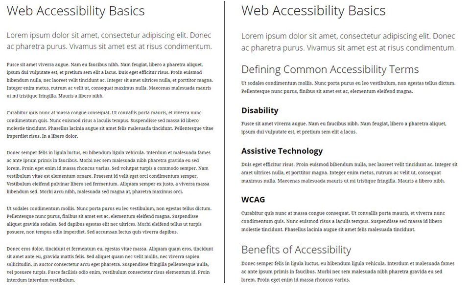
Take the following example of two pages. Both have an H1 of Web Accessibility Basics. Both also contain fictional "lorem ipsum" text as placeholder content. Let's compare the two pages.
Example Page Without Headings
The page on the right has one H1 but no additional headings. To get an idea of what topics are covered on the page, you have to start reading from the top. In addition, someone using a screen reader would have to listen to the page from the top to hear everything covered.
In outline form, the page looks like this:
- H1: Web Accessibility Basics
Example Page With Headings
By contrast, the page on the right contains the same H1 of Web Accessibility Basics. However, the remaining content is broken up by additional headings.
The outline of this page looks like this:
- H1: Web Accessibility Basics
- H2: Defining Common Accessibility Terms
- H3: Disability
- H3: Assistive Technology
- H3: WCAG
- H2: Benefits of Accessibility
- H2: Defining Common Accessibility Terms
In addition to being easier to scan and navigate visually, someone using a screen reader can now jump to any heading level on the page without having to listen to the entire page.
Heading Dos and Don'ts
Do
- Break content into chunks using meaningful headings
- Nest headings hierarchically
- Use "initial caps" for headings
- Use short, but descriptive language
Don't
- Skip heading levels
- Select a heading level based on appearance
- Use bold instead of a heading
- Use full sentences as headings
- Put a link on a heading
